Making a Web3 banking platform feel more accessible.
Branding for AgoraBank, a DeFi and Web3 banking platform, combining research, positioning, tone of voice, visual identity, and campaign applications to balance innovation with accessibility.
- ClientAgoraBank
- SectorFintech / Web3 / DeFi
- ScopeResearch, Positioning, Messaging, Tone of voice, Visual identity, Creative direction, Graphic design, Campaign rollout, Digital design
- Year2023
The challenge was to create a brand that felt both forward-looking and approachable. AgoraBank needed to communicate decentralization, transparency, and innovation without slipping into abstract crypto jargon or excluding less technical audiences.
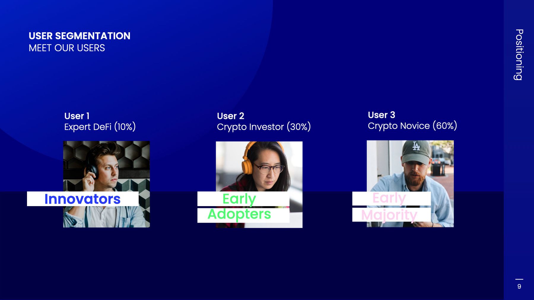
We started by clarifying the platform's vision, audience, and competitive space, then built a brand direction around its decentralized, transparent, and community-focused proposition. From there, we developed a tone of voice that felt inclusive, friendly, and knowledgeable, alongside a visual identity designed to stand out in fintech while remaining accessible to both early adopters and newer users.

- 01brand research and strategic framing.
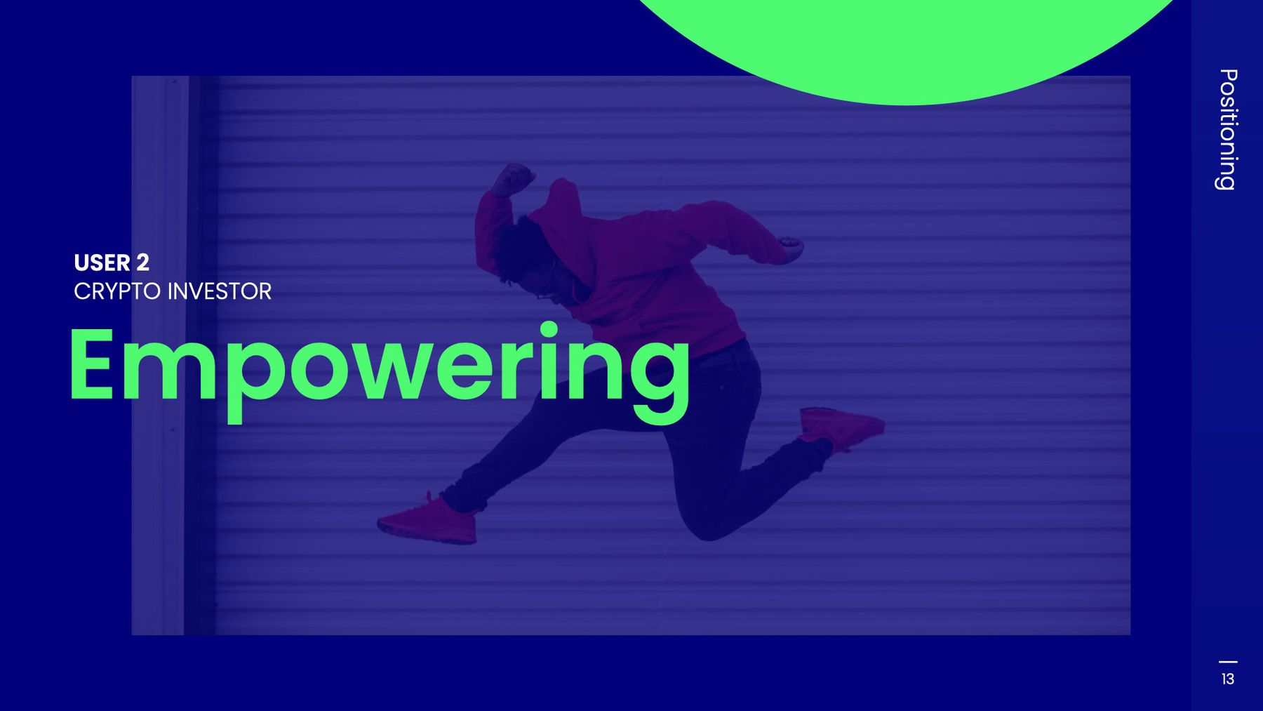
- 02positioning direction.
- 03tone of voice development.
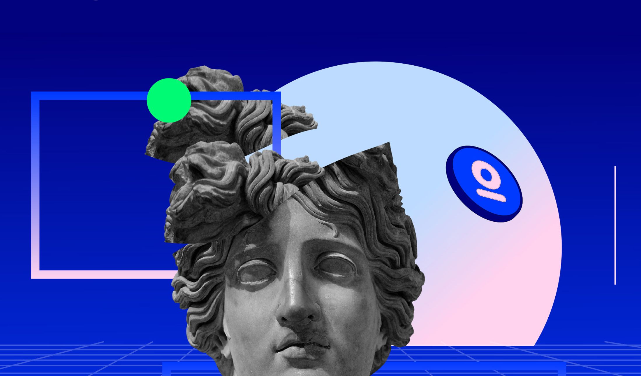
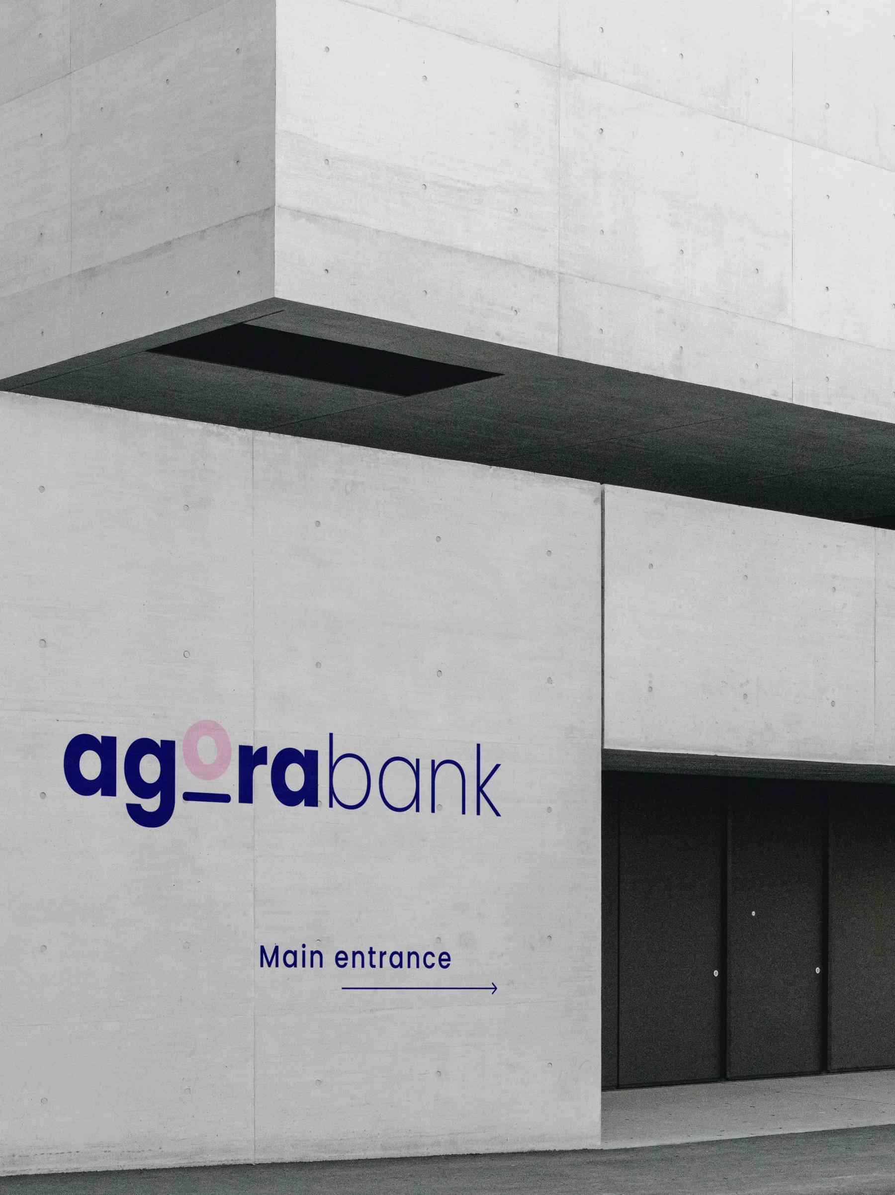
- 04visual identity.
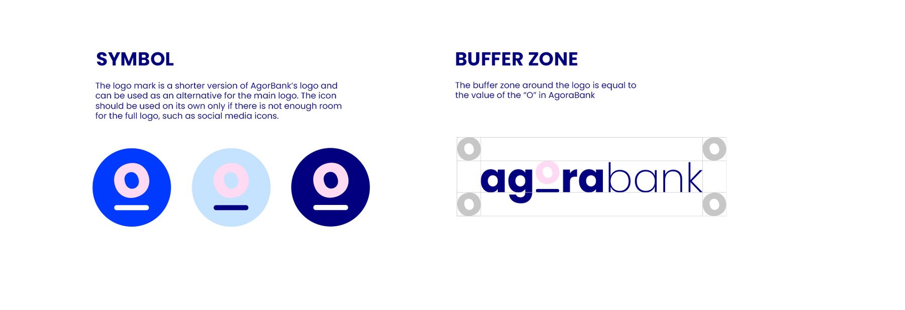
- 05logo system.
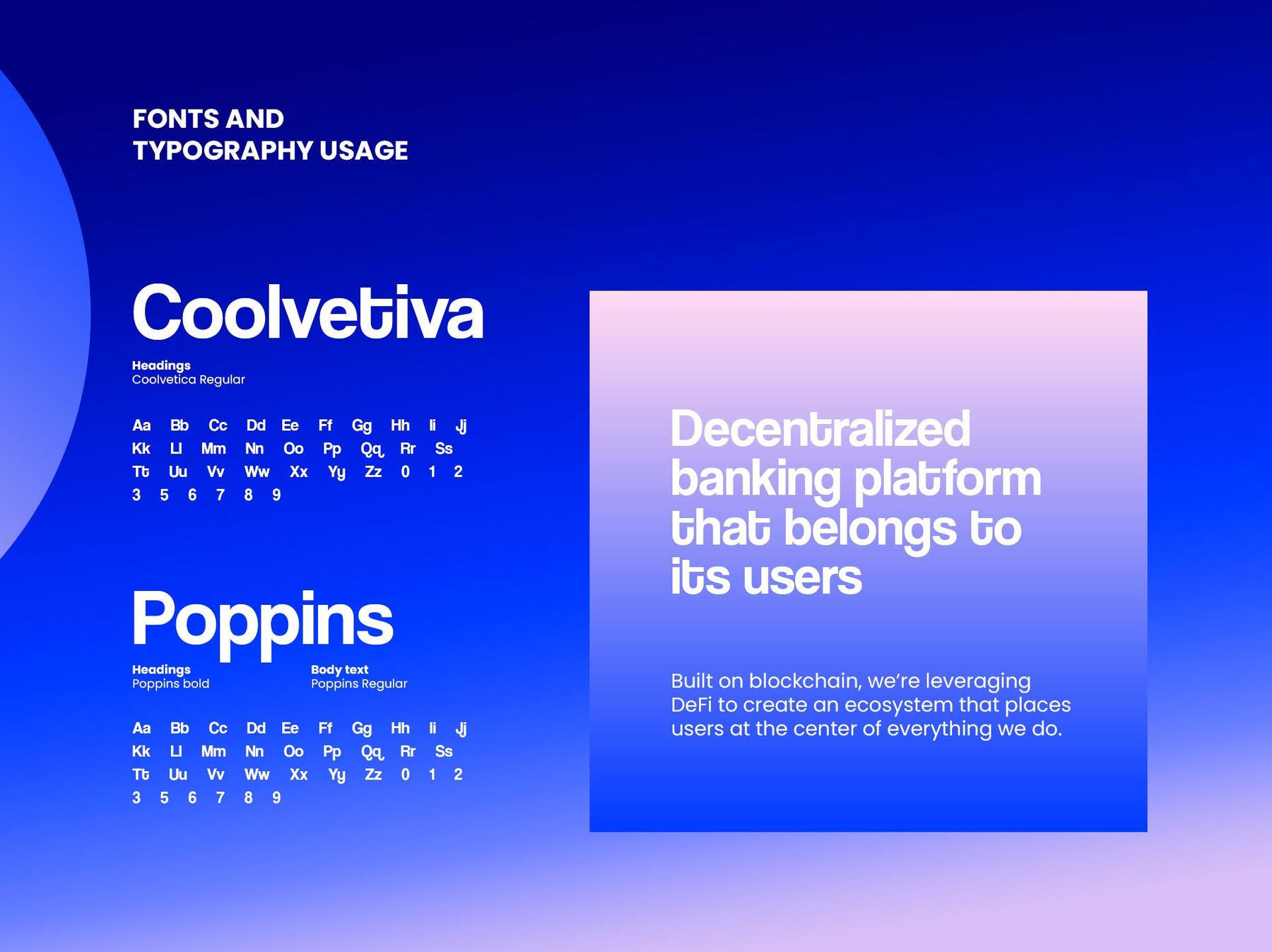
- 06typography and colour palette.
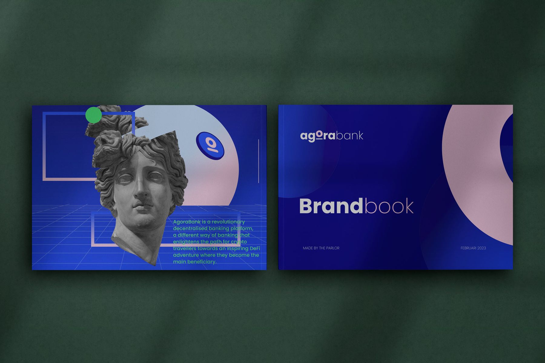
- 07brand book elements.
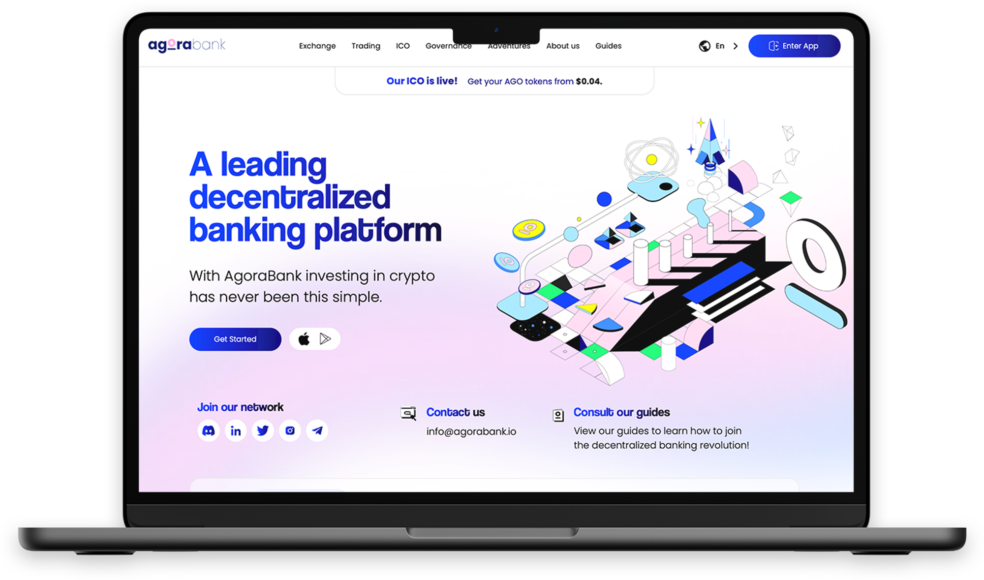
- 08digital design applications.
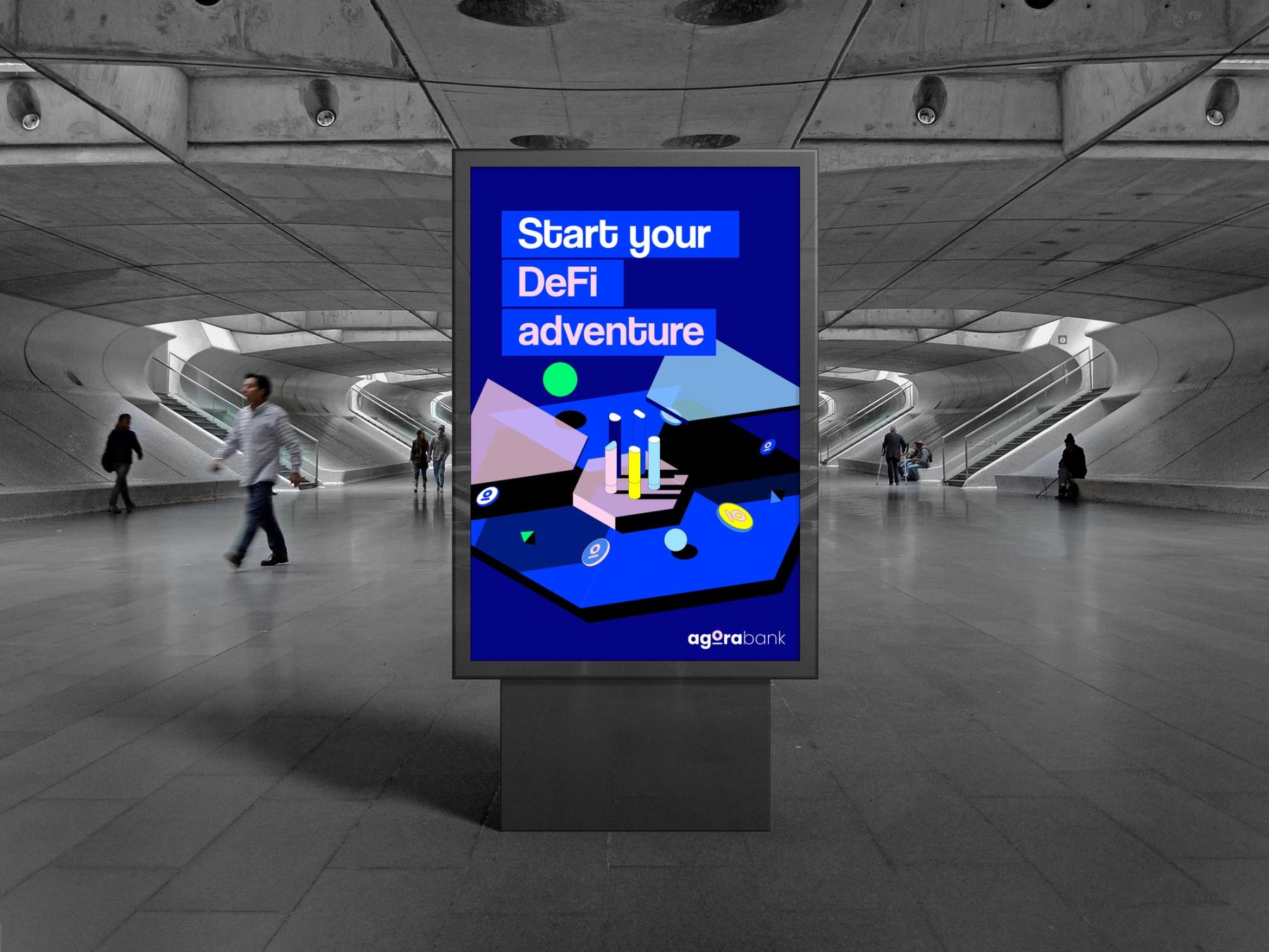
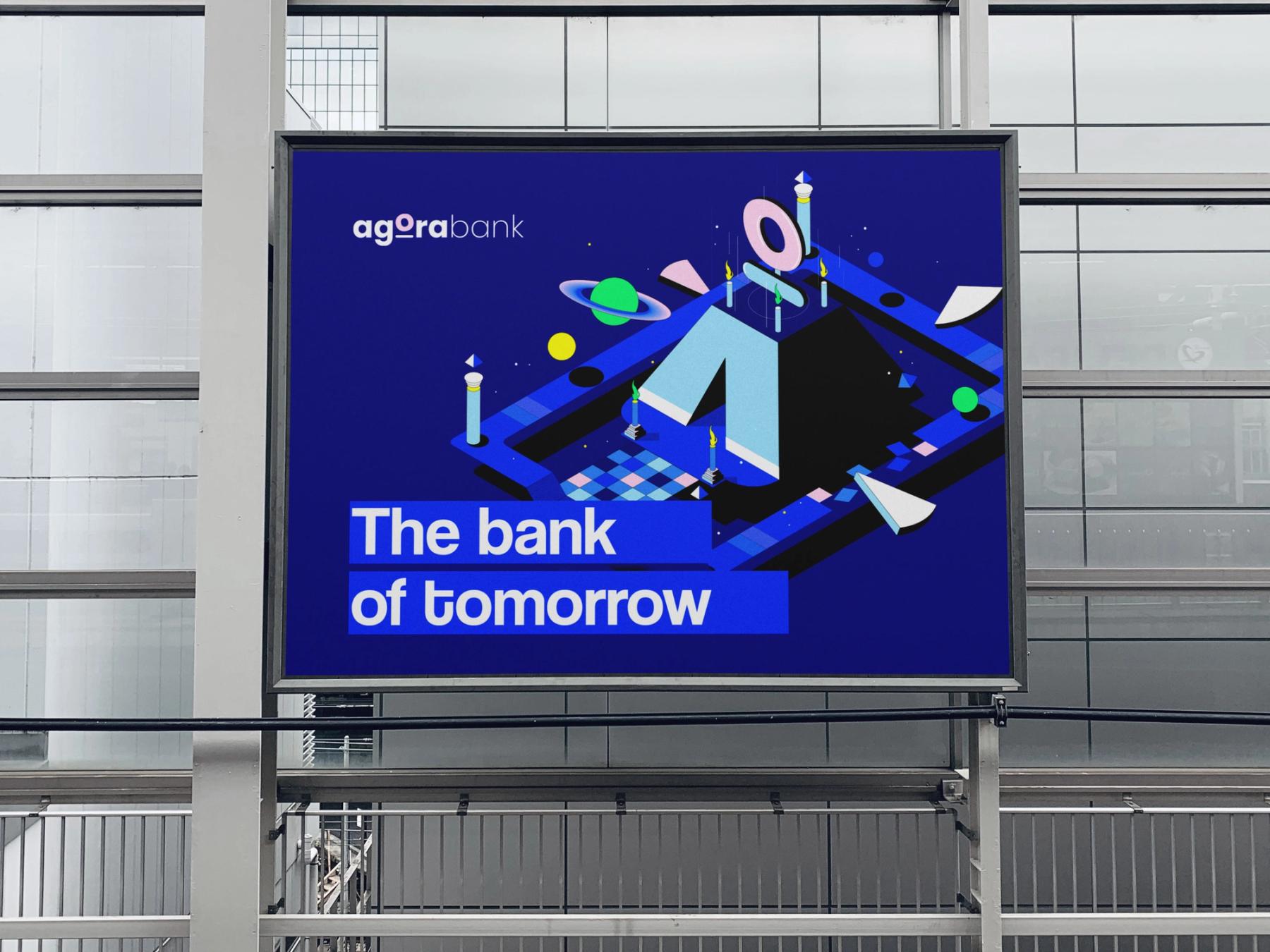
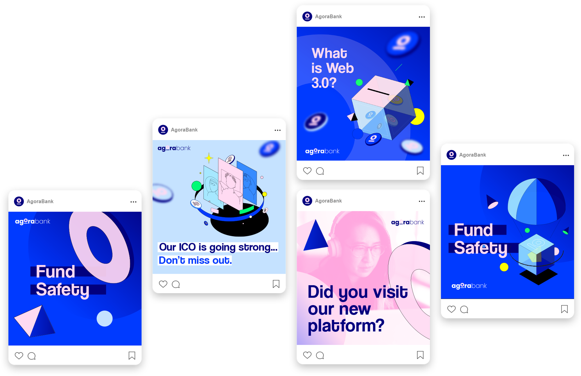
- 09campaign and advertising visuals.
- 10outdoor and social campaign mockups.
“The result was a clearer, more distinctive identity for AgoraBank: a brand that translated a technically complex offering into something more legible, dynamic, and user-facing.”